In a previous post, I outlined my complete guide to optimizing product category pages. While those pages can be great for attracting searchers who are still deciding what specific products they want (and are critical to the sales process,) ultimately they are just “pass-through” pages. Their job is to get the visitors to the actual product pages.
But you can also have visitors bypass those category pages altogether when a more specific intent of their search is clear. That can be done by making every e-commerce product page a landing page for searches specific to that product. No sense trying to get searchers to land on a page that displays all products when their search already indicates which product they want!
To get these product specific searchers directly to the specific products they are looking for, optimization is key. Here’s how…
Assign a Master Product Category
As with optimizing product category pages, optimizing product pages starts with categorization. The last post addressed the need to create strong navigational categories. Now we need to put those categories to use. That’s simple enough. It’s just a matter of determining which categories each product belongs to. But we have to take this one step further and assign each product a single master category.
When products fit into more than one category, many content management systems create a unique URL for each product and category assigned. That means that one product can have more than one valid URL, based on the categories it fits into. This can turn into a major duplicate content problem.
Let’s assume a site visitor is looking for a book on how to build a deck. They are going to need lumber, concrete, a circular saw, and a book on how to do the job. We’ll focus only on the book, which can be found by following any one of these four possible paths:
- Home > Lumber > Books> How to Build a Deck
- Home > Building Materials > Books > How to Build a Deck
- Home > Tools > Books > How to Build a Deck
- Home > Books > Decks > How to Build a Deck
This is simplified, of course, but in order to place the book in those four categories, what you will often wind up with are four different URLs:
- http://www.site.com/lumber/books/how-to-build-a-deck.html
- http://www.site.com/building-materials/books/how-to-build-a-deck.html
- http://www.site.com/tools/books/how-to-build-a-deck.html
- http://www.site.com/books/decks/how-to-build-a-deck.html
That’s four “pages” competing for placement for the same keyword search!
The solution is to assign a single master category for each product, while allowing as many other categories as desired. It is this master category that determines the one and only URL for the product.
- http://www.site.com/books/decks/how-to-build-a-deck.html
It doesn’t matter how the shopper ultimately finds the product because the URL (and supporting breadcrumb trail) will default to this master category.
You’ll likely have to get a programmer involved to make this possible, but it’s definitely worthwhile. That said, there are a couple of less desirable alternatives if the programming option is too costly for you.
Alternative Solution 1: Remove all category classifications from the product URLs, in which case it would look something like this.
- http://www.site.com/products/how-to-build-a-deck-book.html
rather than
- http://www.site.com/books/decks/how-to-build-a-deck.html
Notice that the category name is no longer relevant, and a new category has been created for all products. The drawback to this option is that by removing product classification from the URL, you lose a small but vital search engine relevance signal.
Alternative Solution 2: Implement a canonical tag that points to the master URL for that product. Using the canonical tag to correct duplicate URLs relies on the search engines to properly follow the instructions provided, which they may or may not do. I’ll go into this in further detail a bit later.
One Product, Multiple SKUs
Some products come in multiple shapes, sizes, colors, and other variations. Essentially, they are the same product, with a slight difference. But those differences can require their own SKUs. For many systems, every SKU gets its own page and URL, which can make for a lot of URLs!
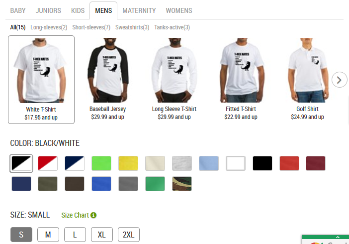
Below is an example of a site that has 52 different styles, 19 colors, and 5 sizes all for the same “t-rex hates” shirt design. Let’s do the math on that…We are looking at 4,940 unique URLs for what is essentially the same product.
We can actually trim that number back a bit because, in some cases, the different styles do (or should) constitute a unique product. How do we determine when this should be the case? Think about the shopper. Is there a strong chance they will search for a “t-rex hates jersey” versus “t-rex hates golf shirt?” That’s quite possible. Therefore, we want those searchers to land on a page that already has that style prominent. This site already, smartly, does that.
But we still have the color/sizing issue. Searchers are far less likely to search using those criteria. Even if they do, the one landing page/URL will suffice. But on this site, we get a new URL for every variable.
Here is a sampling of the URLs:
- www.site.com/trex-hates_tshirt?productId=1321218904#color=navy/white&size=medium
- www.site.com/trex-hates_tshirt?productId=1321218904#color=green&size=x-large
- www.site.com/trex-hates_tshirt?productId=1321218904#color=red&size=3x-large tall
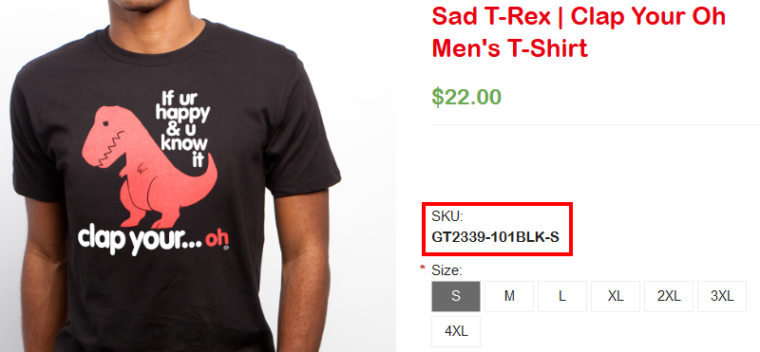
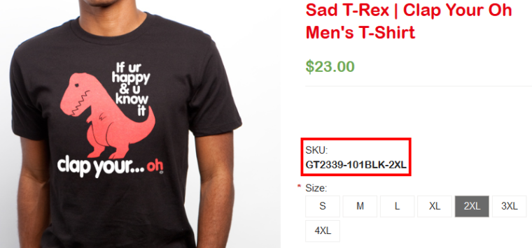
Ideally, you’ll have a single product page/URL that allows the visitor to select their size, color, or any other variations being offered. There is no reason for the URL to change with each selection, even if a separate SKU is required. The database should track which variables are selected and send the appropriate SKU through with the order.
Here is a site that does it this way. Notice the change in SKU based on the selection of the shirt size.
As I said above, not all systems work this way and may require extensive reprogramming. But be aware, this is the best possible fix, and the most error-proof one. But, should you refuse to accept this mission, there are (less attractive) alternatives:
Alternative Solution 1: Implement the canonical tag. The canonical tag on each of these size/color variations would consistently point to the “primary” URL. That’s the solution this site uses, they have their canonical tag pointing to:
- www.site.com/trex-hates_tshirt?
The only time this changes is when you click on a different shirt style, which I already noted makes sense because you do want those as unique landing pages.
Alternative Solution 2: Use Google Search Console to ignore all the parameters on the end of the URLs. What are the parameters? Everything from the “?” and beyond. The URLs above have three parameters: Product ID, Color, and Size. You can tell Google search console to ignore each or all of these.
By doing this, you’re basically telling Google to only consider what should be the canonical URL and nothing more. The downside to this solution is that it is specific to Google. You’ll then have to do the same thing with Bing.
You also need to be very careful that you don’t ignore parameters that are necessary. For example, if the system also uses a parameter to determine shirt style, you want to make sure you are not excluding that in Search Console. Otherwise, you’ll wipe out all of these great landing pages from being found in search.
Also, if product ID is important, you don’t want to tell search engines to ignore that, either. Looking at the URLs above, I would have thought that the product ID was an essential parameter, but it’s not. The same product shows with or without it, which means you do want it excluded from consideration.
Always be careful when messing with search engines and parameter indexing. You have to know what you’re doing or you can really screw up your ability to get key pages indexed.
Implement Canonical Tag
I’ve already mentioned the canonical tag as an alternate solution for a couple of issues above, but I want to address it in more detail here. I consider the canonical tag to be nothing more than a band-aid solution for those previously mentioned issues. But it is also smart to use it as a backup solution that should be implemented across the board regardless.
The canonical tag is a simple line of code that tells the search engines which URL they should be indexing, regardless of the actual URL they are on. It is designed for sites that have these duplicate content/multiple URL issues. Here is what a full canonical tag looks like:
- <link rel=”canonical” href=”http://www.site.com/everything-else-goes-here”>
The search engines use the canonical tag as a signal, but not a directive. Which means they can choose to ignore it if they want. And they will if they believe that the content on the URL being indexed is different enough from the content on the canonical URL.
This is why I don’t consider it a pure fix. You can tell the search engines your preference, but you can’t force them to adhere to it. That leaves your site vulnerable to duplicate content issues.
Yet, even if you are implementing your permanent fixes, it’s still a good idea to implement canonical tags across the board. All it takes is someone linking to your site using a URL with added parameters (such as for tracking purposes) and the search engines can then grab that URL for their index. Without even knowing it, you have duplicate content!
Write Unique Product Titles and Descriptions
Unless you have come up with your own line of products, the products you sell are very likely similar or the same as the products being sold on hundreds of other websites. Which means you’re likely getting your product descriptions from the manufacturer. And this means you are publishing duplicate content on your site.
When search engines see hundreds of products with essentially the same title and description, they have to decide which one of those pages should rank over the others. That’s what the algorithms do by nature, but by using these duplicate product descriptions, you are losing the advantage of being unique. Essentially, you are taking one of the primary ways that search engines determine the value of your site over others completely off the table! Which means you’ll have a hard time getting your product pages to rank over your competitors.
If you can–and I know that this is very time-consuming for sites with lots of products–write unique titles and descriptions for each and every product. This is your opportunity to stand out from every other site selling the same thing. Find your voice and put that into everything you sell. Be fun, be creative, and by all means, add value!
Alternate Solution: If you can’t write your own unique content for your products, you’ll have to rely on user-generated content. That is, getting your customers to create content on these pages for you. So, while we are on that topic…
Allow User-Generated Content
Even if you already have unique titles and descriptions for all your products, allowing your visitors to contribute content to your pages gives you an additional advantage. Not only does it give search engines a reason to keep coming back to reindex the pages, they’ll do so more frequently. And the added UGC can also help push you further up in search rankings.
User generated content comes in various forms. You can decide which are right for your site, but I would consider each of them and implement any and all that you can:
- Reviews: Allow shoppers to write their own reviews of your products/services.
- Ratings: Similar to reviews, you can also have shoppers rate the products.
- Questions: Some shoppers might have questions that they need to have answered before they’ll be willing to buy the product. Giving them a space to ask those questions not only increases the likelihood you’ll get that sale, it also will likely help others with the same questions.
- Stories: Let visitors post their own experiences with your product or service. This is less of a review than it is a way to highlight creative ways your products were used and what solutions they solved for others.
- Pictures: Along with stories, you can let your visitors post pictures that illustrate your products in use.
- Videos: If you allow videos, some users will use this for any and all of the above. They can post a video review, tell their stories, and show the product in action. If a picture is worth a thousand words, a video has got to be worth so much more!
Implement Schema/Structured Data Markup
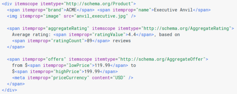
Structured data (or schema) markup allows you to tag certain content with appropriate coding that then allows search engines know how to “interpret” that content correctly. Remember, what visitors see visually is often the result of fairly complex code. Search engines can only read the code and try to interpret it visually, but don’t always get correlations of data.
For example, you may see a SKU number quite obvious on the page, but that number can be buried in code that the search engines are trying to decipher. Structured data allows you to highlight this and other critical pieces of content so there is no ambiguity.
Here is what some schema markup looks like:
Where do you use structured markup? Here are just a few options specific to your product pages:
- Product name
- Product image
- Product description
- Brand
- Reviews
- Ratings
- Special Offers
- SKUs
- Price
- Currency
- Availability
- URL
Using structured data for each of these areas leaves no room for interpretation and tells the search engines exactly what each is. Another benefit, though, is getting rich snippets in search results. Google will often pull information from your structured markup and include it in the search results, such as description and ratings. Having these shown in the search results can increase clicks and help sell your products.
User-Focused Optimizations
Thus far, the strategies addressed in this post have been issues related to search engines. Of course, each of the optimization strategies outlined above is great for users as well, but now let’s address a handful of user-focused optimization strategies for your product pages.
Consistent Layout
The layout of your product pages should be relatively consistent across the board. Occasionally, you have a group of products that requires unique information for which you need to create a new template, but as best as possible, keep all product pages looking the same. This allows shoppers to become familiar with a single layout so they can easily breeze from product to product gathering needed information.
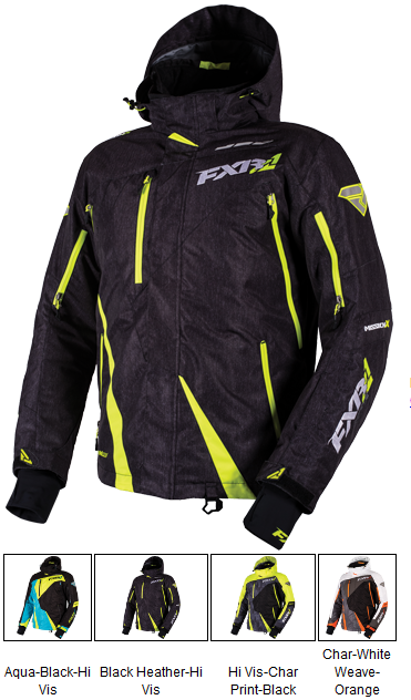
Multiple Image Views
Many product images can be enhanced by providing multiple views of the product. Of course, this isn’t necessary for all products, but if you have something in which a different angle view helps the visitor get a better feel for it, then this will improve the shopping experience. Either the visitor will be more apt to buy the product because they have a more complete visual, or it will reduce product returns from someone buying something that wasn’t what they wanted. Either way, you win.
Product Availability
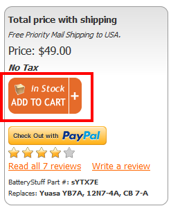
Nobody wants to add a product to their cart only to find out later they can’t get it. Provide some kind of indicator as to whether the product is or is not currently available. If stock is limited, displaying the number of items remaining can be a good motivator to purchase sooner rather than later.
Add to Cart Proximity
Keep your add to cart buttons in close proximity to the product information. You’ll want to check different screen sizes and resolutions on this as these variables can move information and buttons to places you would not have imagined. Considering all variables, making sure that the correlation between product and button is clear.
You also might want to have an option to add the product to a wish list, or save it for later viewing. If the shopper isn’t ready to buy, this can be a nice reminder the next time they log in. Similarly, provide an option that allows the visitor to forward the URL to themselves or a friend for later viewing, perhaps on a different device.
Security Assurances
Every shopper–especially when on your site for the first time–has a trust hurdle to overcome. If they can’t overcome those hurdles, the chances of you getting a sale are pretty slim. Your job is to alleviate their concerns in as many ways as possible to the point where they no longer have reasons to say no.
Here are some trust issues that you need to overcome:
- Do you take credit cards?
- Do you take my preferred form of payment?
- Will my personal information be protected?
- What is your return policy?
- Do you offer any guarantees?
- If I have a problem, will I be able to reach a real person?
- Will my personal information be secure?
- Will my information be used to spam me?
Addressing each of these issues will remove the hurdles that get in the way of the purchase. Once these are eliminated, the decision whether or not to do business with you becomes much easier.
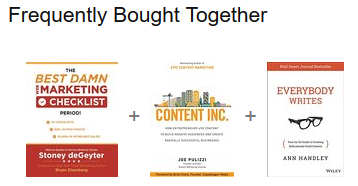
Cross Promotion
Cross promoting products is a great way to increase the average order size. Most shoppers come for what they want, but if they see something else of value during that interaction, they just might add more products to their cart.
Keep Shopper Shopping
Imagine with me for a second that you’re in a grocery store. But the store doesn’t allow you to keep your cart with you as you browse the aisles. Instead, you have to leave the cart at the end of each aisle as you go down and browse the products on the shelves. Every time you grab an item to put in your cart, you have to walk back to your cart at the end of the aisle. And to top it off, you can only add one product at a time.
If any store did that, you probably wouldn’t return, no matter what kind of great deals they offer. But this is exactly what websites do when they force visitors into the cart page every time they add an item. That forces them out of the aisle and back to a cart somewhere completely different from where they want to be.
When products are added to the cart, provide a notification that it’s added, but let the visitor stay exactly where they are to continue shopping. When they are ready to look at the cart, they will. Otherwise, let them shop!
Facilitate Socialization
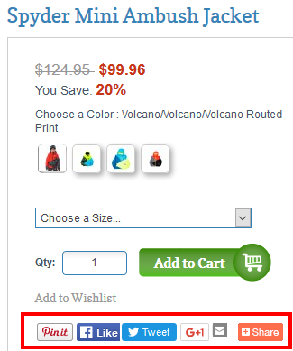
In the age of social media, shoppers are more likely to share a product to their favorite social platform than they are to leave a review. In fact, they’ll often post a mini review on their streams so long as you make it easy to do so.
Providing socialization buttons gives another way for visitors to interact with your brand and become evangelists for your products.
You also might want to make it easier for your customers to get updates about new products and sales. You can easily facilitate this by adding a Twitter or RSS feed that regularly pushes out new content and items that have just gone on sale. You might be surprised to find that these feeds may become more popular than your regular social channels!
E-Commerce Tracking
Finally, no optimization would be complete without making sure your e-commerce tracking is installed and properly working. This provides you with the best opportunity to fine tune your shoppers experience on the site, removing barriers and increasing sales.
Optimizing your product pages can often be the most valuable time spent on marketing and promotion. And the great thing about optimizing these pages is that 90% of it can be handled via a template. Instead of having to optimize hundreds or even thousands of individual pages, optimize the product template and the bulk of your work is done!
Image Credits
Featured Image: Image by Stoney deGeyter
In-post Photos: All images by Stoney deGeyter
All screenshots by Stoney deGeyter. Taken August 2016.
Go to Source
Author: Stoney G deGeyter
The post The Complete Guide to Mastering E-Commerce Product Page Optimization by @stoneyd appeared first on On Page SEO Checker.
source http://www.onpageseochecker.com/the-complete-guide-to-mastering-e-commerce-product-page-optimization-by-stoneyd/

No comments:
Post a Comment