Whether you’re new to Facebook advertising or you’re a “pro”, there’s always room for improvement and certain hacks that can get you more engagement and conversions.
There’s just about a million different ways to succeed – and fail – with Facebook ads, but the hacks below should help lead your campaigns toward success.
These Facebook ad hacks are designed to improve your ad creative, offering unique ways to make an ad more attractive and convertible. So often an ad can fail simply because it’s creative wasn’t thought out as much as the targeting was.
Advertisers can get in the habit of pushing out ad after ad without actually thinking about what makes an ad attractive to users. Facebook is a platform designed around the user experience, and the ads shouldn’t be any different.
Create ads on Facebook that both Facebook and users will love with these six ad creative hacks.
Hack #1: Stock Videos Are Better than No Videos
Tired of hearing that you need to create videos but have no idea where to begin? You aren’t alone.
Not every business has the time or capability to make videos at the drop of a hat for a Facebook advertising campaign. Yet we all know how important video creative is for social media these days.
A video on Facebook receives on average 135 percent more organic reach than a Facebook photo. Photos used to be the most engaging type of creative on social media, but video has quickly surpassed images and is now the thing.
So here’s the solution:
Stock videos.
I know, I know, stock anything is frowned upon. But in a situation like this where Facebook is more willing to show video ads over image ads and people are more willing to respond to video, you need to get video from somewhere.
Plus, we now have so many different stock websites to choose from, you’re bound to find a type of style that fits with your brand and doesn’t feel so stock-like.
Quickly and easily put together a video for your next Facebook ad campaign with these steps:
- Head over to Adobe Stock’s video selection and start there. Adobe has one of the largest selections of stock video footage to choose from, meaning they have something for every type of industry.
- Select a video based on your story. The type of video you choose needs to tell a story and mimic the kind of emotion you’re trying to capture with your ad’s messaging. If you’re trying to get new leads for a financial investment company, the video can begin by focusing on the hardships of investing with a video of money being burned or thrown down a drain. The video can then transition to a person happily sitting at a desk with an advisor. The video needs to tell a story that addresses your messaging, emotion, and solution.
- Make the video your own with branding. No one needs to know that you didn’t spend thousands of dollars and hire an entire production team to produce this video. Simply add a logo or a text overlay to the video and a call to action slide with the company’s information at the end and voila!
Hack #2: Avoid Using the Color Blue in Ad Creative
Facebook’s primary color is blue — #3b5998 to be exact. Using images and videos that have blue tones in your ad campaigns isn’t going to help your ad stand out in the News Feed.
By the way, I’m not referring to a solid blue image with text. I’m talking about anything that has a blue hue to it such as a sky background, ocean waves, or a person standing in front of a blue wall. These blue tones will make the ad blend in with the News Feed, which is exactly what we don’t want an ad to do.
Instead of focusing on blue tones, try using colors that match your brand especially if they’re vivid colors like orange, green, and red.
Orange is blue’s complementary color so not only will it stand out, but it will look darn good in the News Feed.
Hack #3: Be a Fun Ad & Include Emojis in the Ad Copy
Everyone loves a good emoji these days, so why not include one or two in your ad copy? There are two rules to live by when using emojis in your ad copy:
- Do not overuse emojis.
- Only use emojis that make sense with the copy.
No one will appreciate four rain drop emojis, two poop face emojis, and the cat with heart eyes next to copy about booking a winter vacation. The emojis need to be relevant to the action you want the user to make and the emotion you’re trying to convey.
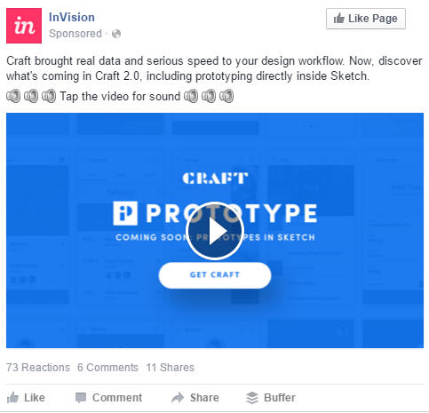
Take this ad for example. They used the speaker emoji to communicate “turn on your sound.” These emojis make for an extra awesome addition because so often people watch videos on social media without their sound on.
By having a little extra encouragement in the ad copy with the speaker emojis, it’s telling users you’re not going to want to watch this without sound. So turn it up!
Hack #4: Don’t Just Rely on the Button for Website Traffic
Facebook ad objectives should be something easy for users to do, and something they’ll actually want to do.
One way of accomplishing both of these things is by including a link to your website/landing page in the ad copy.
Sure, the call to action button will direct users there, but the button can really feel “ad-like.” What I mean by that is just about everyone knows if a Facebook post has “Sponsored” on it and a call to action button, then it’s an ad.
Users, just like yourself, don’t like to be advertised to and forced to do something. We’d rather make the choice ourselves, knowing where we’ll end up.
Psychologically, it can feel more comfortable for users to make the decision on their own to leave Facebook by simply clicking on the link within the ad copy. They know exactly what they’re getting themselves into and they’re choosing to go to that destination, versus clicking on “Learn More” not knowing where they’ll actually go.
Aside from the “feelings” side to this reasoning, adding the URL in the ad copy also gives the user the option to act quickly. If they like what they’ve read and want to respond, give them the option to do so without having to get all the way down to the button.
Hack #5: Design an Ad Your Audience Will Be Attracted To
I know, seems like a common sense type of tip, but it’s actually one of the biggest tips people forget about. Facebook even offers this in their very black and white “Creative Tips” because it’s so important for advertisers to focus on.
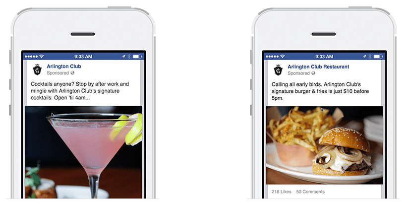
Not only does your ad copy need to speak to your demographic, but your imagery and video, too. Let’s dissect Facebook’s example.
To the left, you’ll see an ad for a restaurant that focuses on a cocktail. This ad is targeting a younger, millennial type of audience that most likely has a 9-to-5 job and enjoys going out with coworkers at the end of the day for a drink. This is a very specific type of person, even though we can probably all relate, and the ad is created just for that part of the restaurant’s demographic.
The photo to the right is by the same restaurant but is targeting their older demographic, the portion of their customer base that comes in just for the food. If the restaurant had used the same cocktail photo to attract that older audience, say 50+ years old, they may have turned the audience away by looking too much like a bar atmosphere and not a restaurant.
It’s quite rare for a business to only have one profile of a customer. This is why it’s so important to create multiple ads, each speaking to your different customers.
Hack #6: Ask a Question Right Off the Bat
We’re all here to provide some sort of solution to our customers, right? Right!
By addressing the issue in the beginning of an ad, you’re stopping a user in their tracks from continuing on with their regularly scheduled News Feed.
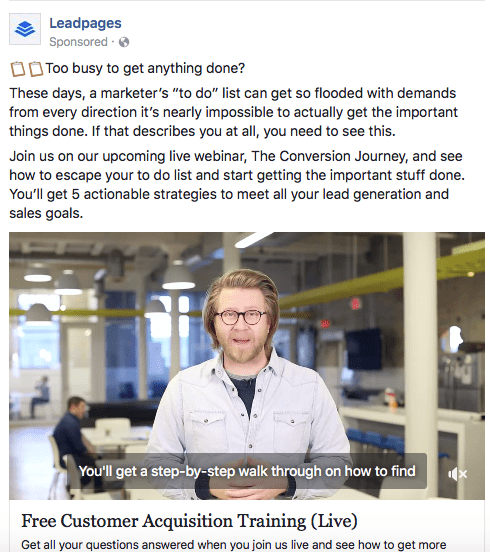
- Need help bulking up, but don’t know which protein powder is right for you?
- Tired of spending your mornings sorting through emails?
- Worried the IRS is going to come after your business?
Each of these questions speaks to a unique audience and addresses a primary concern for them. It gives each user a reason to keep reading the ad, look at the imagery and/or watch the ad’s video.
Don’t believe an ad hack can be as simple as inserting a question at the beginning of the ad copy? A/B test your next ad objective with Ad A asking a question at the beginning of your ad copy and Ad B not asking a question anywhere in the copy.
Summary
The next time you’re working on a creative for a new Facebook ad campaign, try implementing these six hacks and watch your conversions soar.
Image Credits
In-Post Images: Screenshots by author. Taken June 2017.
Go to Source
Author: Ashley Ward
The post 6 Hacks That Will Improve Your Facebook Ads by @ashleymadhatter appeared first on On Page SEO Checker.
source http://www.onpageseochecker.com/6-hacks-that-will-improve-your-facebook-ads-by-ashleymadhatter/


No comments:
Post a Comment