Web design vs. content – which is more important?
Most businesses understand the importance of web design. Most of their interest in web design tends to be what appeals to them. But do you really understand why the design of the website is so vital to the success of your business – even more than the content on it?
Why?
It may not be a question you hear often, but if you’re a web designer, occasionally someone is going to ask you why.
- Why does it matter what side of the page my call to action is on?
- Why is it important what colors I use?
- Why does the size of my images matter?
- Why must I break up my text into such small paragraphs?
Research shows that when it comes to trust, website design elements are exponentially more significant than content.
When questioned about why individuals did not trust a particular website, 94 percent of the responses related directly to web design elements, while only 6 percent made mention of specific content.
While the study cited above was concerned with health websites, it stands as a useful instrument for any web designer given the elements that caused the most problems.
The basis of the mistrust included the following items:
- Busy or complex layouts
- Pop-ups and other “noisy” interruptions
- Small or hard to read fonts
- Lack of vibrancy or eye candy
- Slow website intros and load times
Let’s dive deeper into four of these elements so you can make some judgments of your own.
1. People Trust What They See, Not What You Say
We all agree that content marketing is vital to online businesses. However, content marketing doesn’t occur in a vacuum. It occurs within a framework of design and technology.
Beauty may only be skin-deep, but oh boy, what influence it exerts on the onlooker.
At first, it may seem odd to say that your web design is something that engenders trust. We like to think of ourselves as nonjudgmental when it comes to appearances. However, our common sense and experience tell us that appearances matter.
BJ Fogg, an expert in the study of website credibility has defined the nature of credibility as:
“Believability. Credible people are believable people; credible information is believable information.”
Your task in web design is to anticipate and remove consumer doubts.
Fogg went on to make a couple of significant points about credibility.
First, it is a perceived quality; it is subjective.
Second, it is multi-layered.
In other words, our decision to step forward and regard something as believable or credible is based on a multitude of factors. Each of these factors is operating at the same time. The result is a fast judgment regarding the trustworthiness or credibility of the website.
When assessing credibility, Fogg said that visitors tended to use what is known as the Prominence – Interpretation System. The Prominence – Interpretation system is the theory that a user is engaged in two things: first, the user notices something (gives it prominence), and second, the user makes a judgment about what they have seen (they interpret it).
Beyond the basics, which includes things like terms and conditions, privacy statements, industry seals, memberships, and guarantees, there are a number of other design elements which can increase user trust. Clean design, uncomplicated layouts, and plenty of white space all help calm down the frantic search. And that is what you want to do — you want your user to catch his or her breath.
On that note, I can’t think of a single reason why you would introduce your site or page to a new user with a blast of sound from an audio or video player.
Some sites and marketing tactics are designed to apply pressure and a frenetic mindset on the user to get them to make a rash judgment. But I would never encourage anyone who wants to engage in long-term business to use that tactic.
The other elements you might consider would be correct business details, especially a phone number and testimonials.
2. Site Navigation Builds Confidence
People don’t like blind alleys. People want to know where they are heading.
One of the most basic aspects of intelligent website design is site navigation. Your site navigation needs to be clear, clean, and straightforward. Your site menu is no place to play games or show off your ability to use metaphors.
Think of your site menu as a roadmap. Ask yourself how hard or how difficult is it for people to navigate your site.

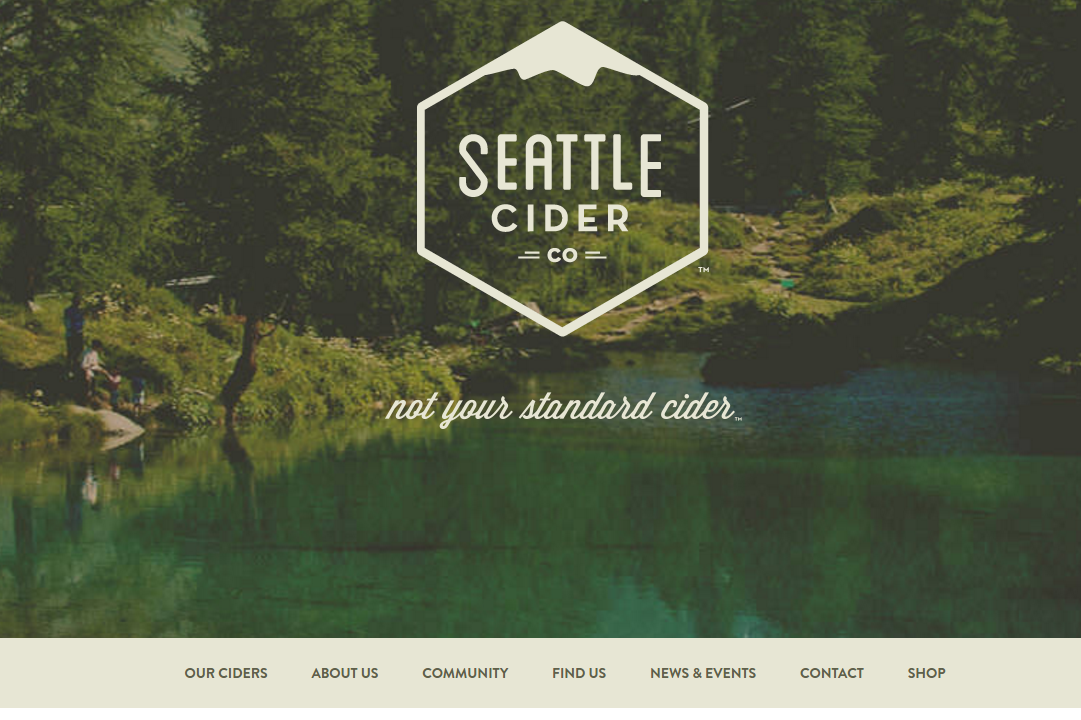
This is a good example of a clean and purposeful navigation that reduces complexity.
Better yet, ask someone who has never seen your site before to navigate their way around it and comment on how easy or difficult it was.
How many websites have you left simply because you couldn’t find what you were looking for due to poor navigation and menus.
Form should follow function. Be careful not to put a single bell or whistle on your site without a damn good reason.
When a page on your website is easy for people to navigate and find their way around it, they are more likely to stay. With a UX Design and UI Design, for example, your site visitors can easily identify the options and navigate once they get to your website.
3. Colors Convert
According to some of the research into web design that I’ve collated, 93 percent of purchasing decisions are based on visual perception, while 85 percent of consumers have cited color as a determining factor in their buying decision.
On top of that, color has been shown to increase readability, comprehension, and understanding.
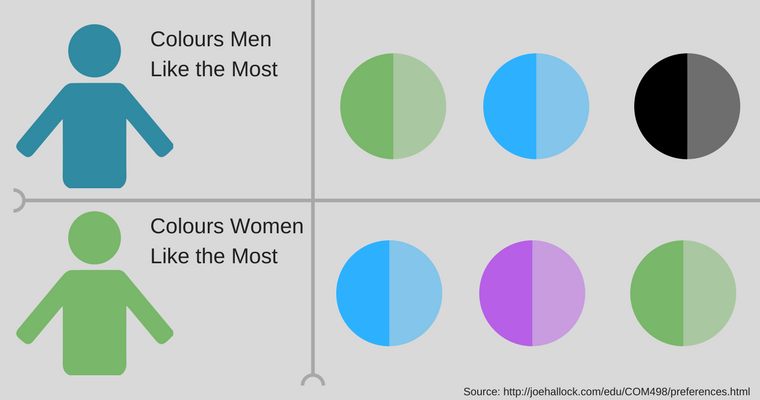
These are all good reasons to pay careful attention to the colors and tones used on your website. Men and women think differently and react differently to color and other design elements on your page.

Pay attention to your target audience and do your research.
Keep your color combinations simple and your calls to action clear and vivid.
Why are most hyperlinks blue? Because blue is considered to be one of the most “visible” colors. Nearly everyone can see it.
4. Professionalism
What might a professional web design mean?
Most online businesses will ask site visitors to give them money at some point. Your customers will expect you to provide a product or service that meets their expectations.
The design of your website, like your own appearance, should increase user confidence. Can you be taken seriously as a lawyer when your website is decorated with Simpson characters? Probably not.
There is something incongruent about meeting a so-called business consultant online via Skype who is wearing a T-shirt, shorts, and a backwards-on baseball cap.

Make sure your images are congruent with your product and target market.
Each culture has its own professional norms and etiquette. Every industry will have its set of standards. You need to consider and be consistent with the standards and expectations of your industry.
Summary
Good web design is that which can properly synthesize layout, color, and format with content, navigation, and rich media. Good design provides you with space for your brand to stand out and communicate confidence, trust, and commitment as it regards the product or service you offer.
Good design can hold a user’s attention, without causing them to miss the point.
Image Credits
Featured Image: Pixabay
All other images created by David Trounce using Pixabay CC0 License and Canva.
Screenshots by David Trounce. Taken May 2017.
Go to Source
Author: David Trounce
The post Why Design Still Trumps Content in Marketing by @twitter.com/malleeblue appeared first on On Page SEO Checker.
source http://www.onpageseochecker.com/why-design-still-trumps-content-in-marketing-by-twitter-commalleeblue/
No comments:
Post a Comment